If you google „Social Network KPIs“, you will get millions of links targeted mostly at social media managers and marketers. These resources provide a wide range of information to engage their users in platforms like Facebook, Twitter, Instagram and information on how to transform their communities into customers.
Nonetheless, there
]]>If you google „Social Network KPIs“, you will get millions of links targeted mostly at social media managers and marketers. These resources provide a wide range of information to engage their users in platforms like Facebook, Twitter, Instagram and information on how to transform their communities into customers.
Nonetheless, there are very few resources that target app developers and provide information on important KPIs that need to be tracked internally to understand the impact of social features on their app and take advantage of their benefits.
Social features provide a complete new level of insights for developers, that can help them tailor their products according to their users' needs, boost retention and make sure engagement is maximized. In this post we have created a list of the most important social KPIs for apps, in order to understand virality, user engagement and make sure you collect the right data to improve your product.
Likes
1. Likes per Post
This KPI will help you rank the user generated posts and understand which of them are most popular among your users.
2. Likes by Content Type
Such a split gives you an understanding of which content users like the most. If a user likes more content of type “football� and less of type “politics�, you’ll be in a better position to personalize the feed accordingly.
Connections
3. Connections per User
The average number of connections per user, will tell you how connected your network is and also will help you identify the most influential users, that can help you grow your graph.
4. Followers-to-following Ratio
This will help you have a cleaner way of identifying your influencers other than just using the number of people following them. The more followers and the higher this ratio, the more influential the user.
News Feed Engagement
5. Scrolled length
This will tell you how much your users are consuming the content of your news feed directly from that screen. A fundamental KPI to predict ad impressions in your feed and choose the right position for your ad placements.
6. Time Spent on Post
, that they will be factoring in the time you spent on stories to rank content in the news feed. If you understand, which type of posts and stories your users are spending more time with, you’ll be able to achieve better personalization.
User Interactions
7. Connection Weight
This is a more advanced KPI that allows you to understand the connections between your users. For each user for each connection, you can calculate a value that will tell you how strong the connection is. You can include profile views, connection date or 1-to-1 interactions. For instance if user A looks at user B’s profile 10 times more than at user C’s, then his connection weight with B will be substantially higher.
Invites
8. Invites per User
If your users are not inviting their friends you won't have organic growth. Invites per users will help you understand first, if your users are inviting and second, which users are doing so.
9. Platform Split
Understand which platform your users are inviting their friends through and promote it better than the others.
10. Invites Conversion
Make sure you know what is the conversion of the invites sent by your users. With deep linking, now you can personalize onboarding and improve the invitation funnel to increase this conversion.
Comments
11. Comments per Post
Will help you understand which posts enhance discussions among your users and tailor the news feed accordingly.
12. Comment Sentiment
Understanding the sentiment (e.g negative, neutral, positive) of the users comments will give you more insights on how they view or prefer certain content.
Social Login
13.Onboarding Conversion by Platform
Social logins improve your singup conversion. Understanding which platform (Facebook, Twitter, etc.) has the highest share on your login, will allow you to push that platform to increase the onboarding conversion. It will also help you understand which from these platforms.
Outbound Shares
14. Shares by Platform
Splitting the shares to other social media platforms will tell you which channel you should optimize to increase your virality.
15. Shares by Content Type
Splitting the shares by content type will tell you which type of content is more likely to improve your virality.
Whether you have a social app or are planning to go become one, it is important to understand how the data you generate from social features, will help you create more actionable insights and increase personalization.
Make sure what you are tracking serves your goals too. Don’t get dragged into vanity metrics like downloads or monthly active users to measure the success of your social features. Collect what matters and don’t overengineer your analytics.
]]>Did you know most apps lose within a month? This is not a new statistic, but the response has evolved. Sure, app retention rates have always been abysmal. Push notifications, email marketing and retargeting were once seen as quick fixes, but the last year
]]>Did you know most apps lose within a month? This is not a new statistic, but the response has evolved. Sure, app retention rates have always been abysmal. Push notifications, email marketing and retargeting were once seen as quick fixes, but the last year has shown a consistently successful method to increase app usage and engagement: going social.
In 2023, the term “social� may feel like an outdated buzzword uttered by the ghosts of tech past, like Farmville, but social continues to pay off in dynamic new ways. Social means creating connections among people, which in turn attracts quality users and bestows inherent virality.
The Power of Network Effects
Traditionally, the concept of network effects is defined as a situation where a service, or product (e.g. app) becomes more valuable as more people use it. Every time a new user signs up for an app, it increases the value for all users and fosters a stronger sense of community.
Creating a social graph in the app, where users can view and connect with friends, is one way to harness the power of network effects and increase the stickiness of the app. The quantity and quality of connections creates a lock-in effect for the user. For example, if a person uses a sports app and is able to connect with ten of their closest friends, then they’re less likely to switch to a competitor app that doesn’t yet have that social graph with their connections.
These ten friends are meaningful reasons to come back to the app over and over again, creating a strong virtuous loop that drives product growth.
The ability to check out their achievements, likes, and comments, reels the user back in, while encouraging them to invite more friends to join the app. The more actively engaged friends a user has, the better the overall experience.
One app tapping into the advantages of network effects to improve the user experience is the giant dating app, Tinder. last week that it’s testing a new social feature that automatically displays which Facebook friends are also using the app. The new “friend-finding� feature called Tinder Social offers users a new shared experience that could ultimately drive more users and growth for the company.
This concept of creating a more “network-centric� experience for users in order to create strong virtuous loops is something we’ve seen many vertical social networks doing to improve user retention and drive growth.
, the song identifying app, announced social features to transition the experience from “pure discovery� to “shared discovery,� enabling artists to share music with their followers.
, the insanely popular trivia game app, introduced true social functionality on a core level. With the features released in May, users can view other users’ profiles, check out their interests, follow them, play against them, send direct messages, or find a specific type of user through the people search.
, the reading app, rolled out a recommendation feature in December, that enables users to follow friends, tastemakers, and the writers and editors behind the stories, to see what they publicly recommend. These curated stories add a layer of trust and relevance to the app experience. When someone you know and trust recommends an article, you are more likely to read it.
In 2023, the term “social� has evolved to mean creating a network of your own, connecting users inside the app’s landscape. Retention, engagement and virality still come down to network effects: If I am connected to my friends, I will come back frequently, and engage with more content. “Social� is not just a buzzword. Turning apps into social products is a proven, viable way to create value for both the app developer and the end user.
Tapglue was created as a way to add social features to your app almost instantly, encouraging users to signup and return daily (even hourly). If you’re looking to turn your app into a social network and make it hard for your users to leave your app, then schedule a demo with us today!
]]>It’s a jungle out there. Everyone from the world’s largest companies to students in their parents’ basement have put out an app. No longer is a “cool� idea enough to survive the pitfalls, threats and competition that lurk around each corner. The entire user experience has to be
]]>It’s a jungle out there. Everyone from the world’s largest companies to students in their parents’ basement have put out an app. No longer is a “cool� idea enough to survive the pitfalls, threats and competition that lurk around each corner. The entire user experience has to be positive starting from the very first entry point - the login.
In 2023, mobile users are expecting the convenience of the social login. They’re exhausted or simply maxed out on usernames and passwords. The social login gives users the ability to register on your website or app using their social media credentials from sites like Facebook or LinkedIn. 86% of people are bothered by having to create a new login for each website. 77% say that the social login is a good solution.
Out of all the social login options being offered today, Facebook is the clear frontrunner with it being used over in 2013 alone. 69% of global internet users are applying it to login to a website as of the . Other social networks didn’t even come close with Google Plus trailing behind with 25% of users applying it to login to a website or app.
The power is in the simplicity of the social login for the user, but where does the power lie for business owners? How does the social login make you a better business?
Account creation is one of the most important steps in the conversion funnel. Getting the registration experience right benefits business owners in several ways, including:
Increased Conversions:
Removing a registration barrier such as the traditional login will result in more website conversions. Users prefer a one or two click process that connects them more easily to your app. More conversions equate to more users that you can target with your brand’s promotional and newsletter content.
Improved Customer Data:
of people say they use false information when creating an account on a new website. The data stored on a social network is typically more accurate and up-to-date compared with data entered on a website to get through a registration process quickly. Additionally, social networks like Facebook give you access to information like demographics, interests, behaviors, location and network connections. Here’s a list of some of the major data properties that are collected by a few of today’s social networks :
Better Personalization:
Social logins give you permission-based insight into users’ real-time locations, relationship statuses, media preferences, and more. This enables you to start personalizing the experience the moment a user connects. For example, you can now greet users by name or display their profile photo, while featuring content and products that match their interests.
Reduced Risk of Abandonment:
of U.S. consumers say they have abandoned a site or app before registering because they were uncomfortable with the amount or type of data being requested. A social login is a less invasive option when in fact you do get user data in return.
Increased Engagement:
During future visits, the user will be able to re-enter quickly and not have to remember the unique username and password for your website. This increases the likelihood of future logged in sessions, while eliminating the frustration caused by password reset processes.
For app publishers, social logins provide a fantastic way to capture rich, permission-based identity data about users directly from the source. This information can be leveraged to customize marketing communications and site experiences, resulting in increased conversion rates and engagement.
Tapglue was created as a way to add social features to your app almost instantly, encouraging users to signup and return daily (even hourly). If you’re looking to increase user signups and customer engagement, then schedule a demo with us today!
]]>For the last month we have been working on creating , a framework on iOS for integrating full features into third party apps. This includes GUIs and graphical assets like images and also interacting with our current SDK which is responsible for networking and caching. One of the fundamental
]]>For the last month we have been working on creating , a framework on iOS for integrating full features into third party apps. This includes GUIs and graphical assets like images and also interacting with our current SDK which is responsible for networking and caching. One of the fundamental requirements was the support of the biggest dependency management tool out there for iOS: CocoaPods.
Too our big surprise there were not many examples of frameworks that do something similar to our goal, create a full feature with its own designs and UX to be integrated into third party apps. The most similar examples we found actually avoided using storyboards and xib files all together and did views purely in code.
In this post our goal is to create a step-by-step guide on how to create a framework with storyboards, xibs, assets and localisation that works with CocoaPods. A project containing all the code can be found .
Setup
To start we recommend using CocoaPods own template for creating frameworks by running
pod lib create MyFramework
You can find further documentation .
We will be using Swift and a demo app, for the sake of simplicity, will not use any test frameworks.
This sets up a framework connected to a demo application you can then use to try out our framework with. In our case it looks like this:
This also generates the podspec for us, for now we'll just leave it the way it is.
Lets get started!
Lets start by creating a storyboard and a view controller with a tableview. Embed your view controller in a UINavigationViewController and make the navigation view controller the initial view controller.
We link this with the view controller we will create called FrameworkVC. To spice things up we will implement our cells in xibs, we name it OurCell.xib and Assign it the reuse identifier OurCell
Now lets have a look at how we can combine all of this together in the view controller:
import UIKit

public class FrameworkVC: UIViewController {

    @IBOutlet weak var tableView: UITableView!
    override public func viewDidLoad() {
        super.viewDidLoad()
        let podBundle = NSBundle(forClass: FrameworkVC.self)

        let bundleURL = podBundle.URLForResource("MyFramework", withExtension: "bundle")
        let bundle = NSBundle(URL: bundleURL!)!
        let cellNib = UINib(nibName: "OurCell", bundle: bundle)
        tableView.registerNib(cellNib, forCellReuseIdentifier: "OurCell")
        tableView.estimatedRowHeight = 80
        tableView.rowHeight = UITableViewAutomaticDimension
    }
}

extension FrameworkVC: UITableViewDelegate {}

extension FrameworkVC: UITableViewDataSource {
    public func tableView(tableView: UITableView, cellForRowAtIndexPath indexPath: NSIndexPath) -> UITableViewCell {
        return tableView.dequeueReusableCellWithIdentifier("OurCell")!
    }

    public func tableView(tableView: UITableView, numberOfRowsInSection section: Int) -> Int {
        return 1
    }
}
To load the xib file we need to use a bundle associated to the framework itself, hence in the viewDidLoad we ask for the bundle of the FrameworkVC and get the bundle of the same name as we declared in the podspec. At this point we need to head over to the podspec to update it to include our storyboard and xib file.
Pod::Spec.new do |s|
  s.name             = "MyFramework"
  s.version          = "0.1.0"
  s.summary          = "A short description of MyFramework."
  s.description      = <<-DESC
                       DESC

  s.homepage         = "https://github.com/<GITHUB_USERNAME>/MyFramework"
  # s.screenshots     = "www.example.com/screenshots_1", "www.example.com/screenshots_2"
  s.license          = 'MIT'
  s.author           = { "John Nilsen" => "john@tapglue.com" }
  s.source           = { :git => "https://github.com/<GITHUB_USERNAME>/MyFramework.git", :tag => s.version.to_s }
  # s.social_media_url = 'https://twitter.com/<TWITTER_USERNAME>'

  s.platform     = :ios, '8.0'
  s.requires_arc = true

  s.source_files = 'Pod/Classes/**/*.{swift}'
  s.resource_bundles = {
    'MyFramework' => ['Pod/Classes/**/*.{storyboard,xib}']
  }
end
There are two significant changes here, on one side we filter the source files by extension by adding .{swift} and since we're putting storyboards and nibs in the classes folder we changed the resource_bundle to Pod/Classes/**/*.{storyboard,xib}
Now we head over to the Example app and executes pod install. In Xcode the storyboards and xibs will now be displayed in a different group: Resources
Hooking the pod into the app
Since this is a framework we need to hook it up into the demo app to be able to see the results of our work. Lets start by adding a segue into our view controller. For this I will add a new class: MyFramework where we can add the segue call.
import UIKit

public class MyFramework {

    public static func performSegueToFrameworkVC(caller: UIViewController) {
        let podBundle = NSBundle(forClass: FrameworkVC.self)

        let bundleURL = podBundle.URLForResource("MyFramework", withExtension: "bundle")
        let bundle = NSBundle(URL: bundleURL!)!
        let storyboard = UIStoryboard(name: "FrameworkStoryboard", bundle: bundle)
        let vc = storyboard.instantiateInitialViewController()!
        caller.presentViewController(vc, animated: true, completion: nil)
    }
}
As you can see we wrote the exact same code for getting the bundle, to tidy up we will create a method to generate it for us inside the MyFramework class.
    static var bundle:NSBundle {
        let podBundle = NSBundle(forClass: FrameworkVC.self)

        let bundleURL = podBundle.URLForResource("MyFramework", withExtension: "bundle")
        return NSBundle(URL: bundleURL!)!
    }
With that refactoring we can tidy up both MyFramework and FrameworkVC.
Thats it! Now we can hook it up into the demo app. If we head over to the ViewController in the Example for MyFramework folder we just need to add the segue call in viewDidAppear
import UIKit
import MyFramework

class ViewController: UIViewController {

    override func viewDidAppear(animated: Bool) {
        MyFramework.performSegueToFrameworkVC(self)
    }
}
When running ti you should see something like this:
Adding images into the mix
Lets improve our cell design by adding an image to it. First we create an asset catalog in the Classes folder of MyFramework. Then we press plus to add a image set. Then we add the following images.
Lets redesign our cell to look like this
If we were to run pod install on our project it would break. We need to add these new files to the resource bundle.
Our podspec should look something like this after fixing the issue:
Pod::Spec.new do |s|
  s.name             = "MyFramework"
  s.version          = "0.1.0"
  s.summary          = "A short description of MyFramework."
  s.description      = <<-DESC
                       DESC

  s.homepage         = "https://github.com/<GITHUB_USERNAME>/MyFramework"
  # s.screenshots     = "www.example.com/screenshots_1", "www.example.com/screenshots_2"
  s.license          = 'MIT'
  s.author           = { "John Nilsen" => "john@tapglue.com" }
  s.source           = { :git => "https://github.com/<GITHUB_USERNAME>/MyFramework.git", :tag => s.version.to_s }
  # s.social_media_url = 'https://twitter.com/<TWITTER_USERNAME>'

  s.platform     = :ios, '8.0'
  s.requires_arc = true

  s.source_files = 'Pod/Classes/**/*.{swift}'
  s.resource_bundles = {
    'MyFramework' => ['Pod/Classes/**/*.{storyboard,xib,xcassets,json,imageset,png}']
  }
end
Notice the resource_bundle now includes extensions like xcassets, json, imageset and png in addition to the ones from earlier.
Now run pod install from the Example folder and we're all set again!
Tips
Some of the minor issues I ran into were related to the pod not being updated when executing pod spec lint, we usually solved all of these doing a pod cache clean --all and executing pod spec lint again.
When writing a framework like this we would recommend providing the view controllers themselves and not the segues, and provide delegation of the most relevant parts of the view controllers. Thats the approach we decided to use for
Wrapping up
Thats it! If you want further examples of how to implement this I recommend you read the source code.
]]>We live for our clients’ successes. There is no better feeling than when we can help them to achieve their goals and help them to improve retention and engagement.
, created by Michael Szumielewski, is a perfect example of an app which excels at both. Stepz is a convenient pedometer
]]>We live for our clients’ successes. There is no better feeling than when we can help them to achieve their goals and help them to improve retention and engagement.
, created by Michael Szumielewski, is a perfect example of an app which excels at both. Stepz is a convenient pedometer and step counter app for iOS. Launched in April of 2014, Stepz has 2.2 million downloads, a 4.5 stars based on 5,000+ worldwide reviews, and is helping millions of people stay healthy and shatter their walking goals. Starting in January 2015, Stepz took off in several countries around the world, captured the #1 spot in the Fitness & Health category in Germany last year, and remains in a top position today.
An indie app maker for the last three years, Michael was focused on retention from day one. He built daily goals and achievement badges into his app to increase motivation. For example, if a user hits the 277 mile mark, they receive an achievement badge that informs them that they walked the distance of the Grand Canyon.
The Features
Adding a social component was important Stepz' growth, and ultimately that is what lead Michael to Tapglue. Before Tapglue, not a lot of people were sharing their achievements externally on social media, but if they did, the results were great. For example, , who has more than 1M Twitter followers, sharing his Tokyo Achievement Badge. Michael started to focus on how to harness the power of social networks within Stepz and eventually came across Tapglue.
Last December, Stepz worked with Tapglue to roll out the following features:
- Individual User Profiles - which can connect to Facebook
- Stepz Friends - which enables users to connect with friends, colleagues, and family to count steps together.
- A leaderboard - which enables friends to compete with each other when it comes to highest number of steps
The Integration
Stepz chose Tapglue over building the backend for two reasons: time and stability. Michael shared that he wear a lot of hats and that building a social API by himself would have taken significant time. Another deciding factor was that he doesn’t have to do any maintenance on the server side, which frees up a lot of time.
Michael shared:
“The Tapglue API is rock solid, and the technical support was excellent. The documentation was easy to understand, and if I had any questions, I could reach out to them and get immediate feedback.�
Within days, Tapglue enabled Stepz to create individual user profiles connected to the user’s Facebook page. After signing up, the user can easily add his or her friends already on Stepz, or by connect with friends via Facebook, under the Stepz Friends tab. After accepting a friend request, the user is able to see the steps of each friend. Stepz also added a leaderboard that is sorted by highest number of steps as a way to add some friendly competition.
Connecting with friends is critical for both retention and for fitness goals. Michael explains:
“Numerous studies show a strong correlation in sharing progress and shedding weight. Adding a social component to Stepz helps our users meet their goals and positively impacts app retention.�
The Results
Within 60 days of the Tapglue integration, Stepz saw an increase of around 10% in both the daily time spent in the app per user and the number of times a user launches the app per day. We have also seen the coveted viral effect. Significantly more of Stepz’s users are inviting their Facebook friends to download the app and compete on the leaderboard.
Michael is thrilled:
]]>“Ultimately, integrating Tapglue was an inexpensive and easy way for me to test if community features will grow traction. So far the results have been solid. I look forward to adding more social features, and to focus on continuing to improve onboarding with new app updates.�
Pocket, the world's leading save-for-later service, announced an exciting update late last year, and essentially evolved from a normal app to social platform. The Pocket team rolled out “Recommendations� enabling users to not just capture, read, and watch the media most important to them, but to connect with other users
]]>Pocket, the world's leading save-for-later service, announced an exciting update late last year, and essentially evolved from a normal app to social platform. The Pocket team rolled out “Recommendations� enabling users to not just capture, read, and watch the media most important to them, but to connect with other users and discover and recommend content.
This shift to social platform follows a trend we’ve observed from other key players including , or . These platforms are now leveraging the effect of networks to enable better discovery and ramp up user engagement.
Pocket is an excellent example of a simple app that transitioned into a powerful social network. Below we take a closer look at the features Pocket added, how they have impacted retention, and what insights you can take away for your app.
Embedding the social features into the UX
A quick glance at Pocket’s updated UX proves Pocket’s commitment to social. Three of its four main tabs in the navigation bar (Recommended, Notifications, Profile) are related to new social features. The Recommended and Notification tabs feature a notification bubble designed to create expectation and indicate new content when the app is freshly launched.
Pocket now takes advantage of two standard features of successful social networks: the user profile and an activity feed. The user profile enables individuality, making the experience more personal with a profile picture and stores the user's history of recommendations. The notifications are combined with push notifications. They are important triggers for personalized and relevant notifications within your social graph.
Recommendations: A smarter way of sharing
Another exciting feature is the new “Recommend� section where users can follow friends and influencers who can then recommend stories they find interesting. Here’s a quick look at how Recommendations work:
On every story screen, Pocket has added a “Recommend� button. Once a user taps “Recommend,� he or she can add a comment, and then he or she has the option to share the recommendation to Twitter or Facebook simultaneously, which has the ultimate goal to drive new new users to Pocket. A user can also recommend the story by quoting some part in the text.
Recommendations show up on the news feeds of people following the user and are shown on the user’s public profile, where Pocket aggregates all recommendations and makes them accessible to the community.
Smartly Growing the Social Graph
In order to have a sustainable network and avoid the empty room problem, users need to connect with each other. Pocket tackles this process in their “Find Users� process. The first thing a user sees after clicking the “Recommended� icon is a big banner prompting them to add fellow users. This feature is well communicated and easily displayed, enabling the user to understand the need to connect with others. Pocket recommends prominent users and influencers. It also prompts the user to import Facebook, Twitter, and address book contacts.
The Power of Pocket’s Social Network
With these new features, Pocket’s users don’t only come back to the app to read stories they had previously saved, but to discover new content through their friends and influencers. The experience of reading now has a social element included.
Pocket’s users now have access to curated stories, recommended by users with similar taste and a credible recommendation history. When someone you know and trust recommends an article, you are more likely to read it. By creating credibility through social networks, Pocket has undoubtedly dramatically increased engagement.
There is also a viral component that needs to be mentioned. With more advanced onboarding, including the ease of inviting contacts, users will be even more incentivized to invite their friends. Onboarding combined with automatic push notifications related to the social graph will enable better discovery and make the experience more relevant.
Ultimately, Pocket has realized that a social network built on top of their content is a lot more powerful for discovery and engagement. It isn’t just Pocket that can benefit from network effects. No matter what type of app you have built, adding a social layer can boost retention and engagement.
]]>We are thrilled to announce that Tapglue has , one of the World’s most prestigious startup accelerators, and has made the move across the Atlantic. So just why would we do the move to Boston, particularly in winter?
Boston is ranked as one of the top
]]>We are thrilled to announce that Tapglue has , one of the World’s most prestigious startup accelerators, and has made the move across the Atlantic. So just why would we do the move to Boston, particularly in winter?
Boston is ranked as one of the top cities in the world for startups. For years, Boston has topped the list for most venture capital invested per capita across the US, and this combined with numerous top universities (e. g. Harvard and MIT), has made the city an ideal home for aspiring tech companies.
With a reputation for churning out hugely successful companies, and a track record in the mobile space, the Techstars program in Boston attracts top talent globally. Techstars Boston has produced some of the best funded classes across all of Techstars programs, including Localytics, a predictive app marketing and analytics company. After joining Techstars in 2009, Localytics stayed in Boston, opened offices in San Francisco and London, and ultimately raised $60M in funding. Other highly successful Techstars alumni include SendGrid, Digital Ocean, Keen.io or Leanplum.
We couldn’t be more excited to join a network of such great companies and to be now part of the unique Boston startup community.
Image Credit: ()
]]>
After analyzing MapMyRun in the Health & Fitness category in the first post of this series, we now shift our focus to the News category. Therefore we have analyzed Nuzzel, a vertical social network that recently has been emerging as an innovative way to consume news and trending topics from
]]>
After analyzing MapMyRun in the Health & Fitness category in the first post of this series, we now shift our focus to the News category. Therefore we have analyzed Nuzzel, a vertical social network that recently has been emerging as an innovative way to consume news and trending topics from the internet.
Nuzzel is a social news aggregator, that uses big social networks, such as Twitter and Facebook to extract the most popular news articles from a user’s social graph. It basically aggregates content that is being shared within the user’s network in social media and feeds it into the app. Nuzzel also shows news shared by friends of friends, providing the user with an extended graph to get news recommendations from.
Nuzzel is an interesting example as it piggybacks the major social networks to become a relevant vertical network for news itself. To understand how Nuzzel leverages network effects, we analyzed its social user experience and put together our learnings in a presentation.
Key Takeaways
100% Social
- The whole consumption is based on content that your social graph is sharing in social media.
- Every shared article contains the pictures of your friends to increase relevance and credibility.
- 2nd degree connections (friends of friends) are used to enhance content discovery (expanded social graph).
High Dependency on Twitter
- Twitter is pushed as the core social login during onboarding.
- As for now, Nuzzel seems to pull in the majority of news from Twitter.
- Amount of content is significantly lower if user has not connected a Twitter account.
Customizable Experience
- Nuzzel offers push notifications and emails as channels to distribute recommendations.
- These channels are highly customizable. The user can set thresholds for when a notification should be triggered.
- Besides the major news feed created by a user’s social graph and topic-based feeds, you can subscribe to other user’s news feeds to consume the content stream fueled by their social graph.
An app completely based on the social graph
Nuzzel tackles news discovery using the social graph of existing networks as the backbone of its experience. Instead of using complicated algorithms and explicitly asking the users for input on preferences, it takes advantage of the user’s implicit interests through her network and simply aggregates the news trending in her social graph. The huge amount data available in social media enables apps like Nuzzel to offer the user an interesting way to discover news content. Thus, this is a great example on how to connect your app with external social networks and take advantage of the publicly available data.
At the same time, Nuzzel is highly dependent on other 3rd parties. It doesn’t own any content nor the social graph of users. One might think Nuzzel should try to create its own social and interest graph rather early to achieve independence from Twitter and Facebook. Otherwise every restriction in the APIs of the two giants could cause serious trouble for the rising social news app.
]]>
We are excited to start to year with our latest product update: The release of the Tapglue Android SDK. Our new SDK makes the integration on Android now as easy as on iOS. By using our SDK you have the whole Tapglue platform at your fingertips. It takes away the
]]>
We are excited to start to year with our latest product update: The release of the Tapglue Android SDK. Our new SDK makes the integration on Android now as easy as on iOS. By using our SDK you have the whole Tapglue platform at your fingertips. It takes away the majority of implementation work, so you can concentrate on an outstanding user experience and on growing your community.
Our mission is to make the power of network effects accessible to every product and every developer. A big part of this is developing a powerful, flexible and scalable API that offers all necessary backend functionality you need to build a social experience around your product. However, we think that a simple and fast integration is as crucial as a comprehensive feature set. That’s why we put a lot of effort into our Android SDK - with many great things to come in the future.
By releasing Tapglue to the Android Community we’re bringing our platform to the biggest mobile ecosystem out there. Besides the API communication, our SDK also solves stuff like offline behavior and parsing in the most efficient way. This puts you into the position to focus on implementing smooth user flows, lovely UIs and stunning animations.
We applied the same principles as we did to our :
- Fast Integration: You can add Tapglue to your app with just a few lines of code. We've internally implemented our API in test apps in less than an hour.
- Open Source: From the day Tapglue was founded, we’ve manifested our long term commitment to open source. We believe open source is the way forward to drive innovation and learn from the community. We encourage all of you to contribute to the Tapglue platform.
- Performance: Leaving the smallest possible footprint in the customers’ apps is of our highest priorities. When designing the architecture our SDK, we made sure to use latest technology and best practices to deliver an outstanding performance.
- Offline Behavior: We know the problems you can encounter when developing in the mobile ecosystem. That's why we put emphasis on the details. Tapglue will work seamlessly even if your user is offline or on a bad connection.
- Lightweight: Our SDK doesn't make your project any heavier. It's only 100KB in size and won't stress your users' bandwidth when downloading your app.
Get started with the Tapglue Android SDK
We can't wait for you to try out what we've built and see all the different things you’ll build with Tapglue. We also appreciate any kind of feedback!

We've put together an that includes all the information you need to get started. Head over to our to get access to the Tapglue platform and start building something awesome today!
]]>
It is no secret that integrating social features into an app, thereby letting the product become a network, can have an immense impact on retention and growth. Companies like Sport.com have experienced an after turning their app into a social network. We
]]>
It is no secret that integrating social features into an app, thereby letting the product become a network, can have an immense impact on retention and growth. Companies like Sport.com have experienced an after turning their app into a social network. We see impressive results amongst our customers, too. Also on an industry level social seems to be highly relevant to drive adoption and loyalty: Localytics - one of the World’s leading mobile analytics providers - reports that (together with weather apps).
For someone who attempts to create a more social experience around a product or who tries to build a social network from scratch, finding the right user experience and feature set might seem overwhelming. However, if you look more closely into a variety of social products you will notice that there are recurring UX patterns which are surprisingly similar.
To decode the success of social apps we have extracted the 7 most important features and took a closer look. We not only want to explain common patterns and why they are so impactful, but also give examples on what a successful implementation can look like.
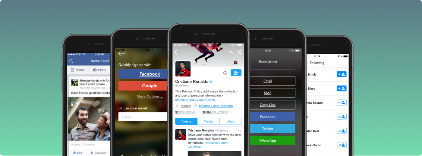
1. Social Login
- Accelerates signup process and decreases dropout rates during onboarding
- Allows access to valuable user data such as email address, profile picture, interests, likes
- Leverages existing social connections to grow the social graph rapidly
- Facebook by far the most adopted social login
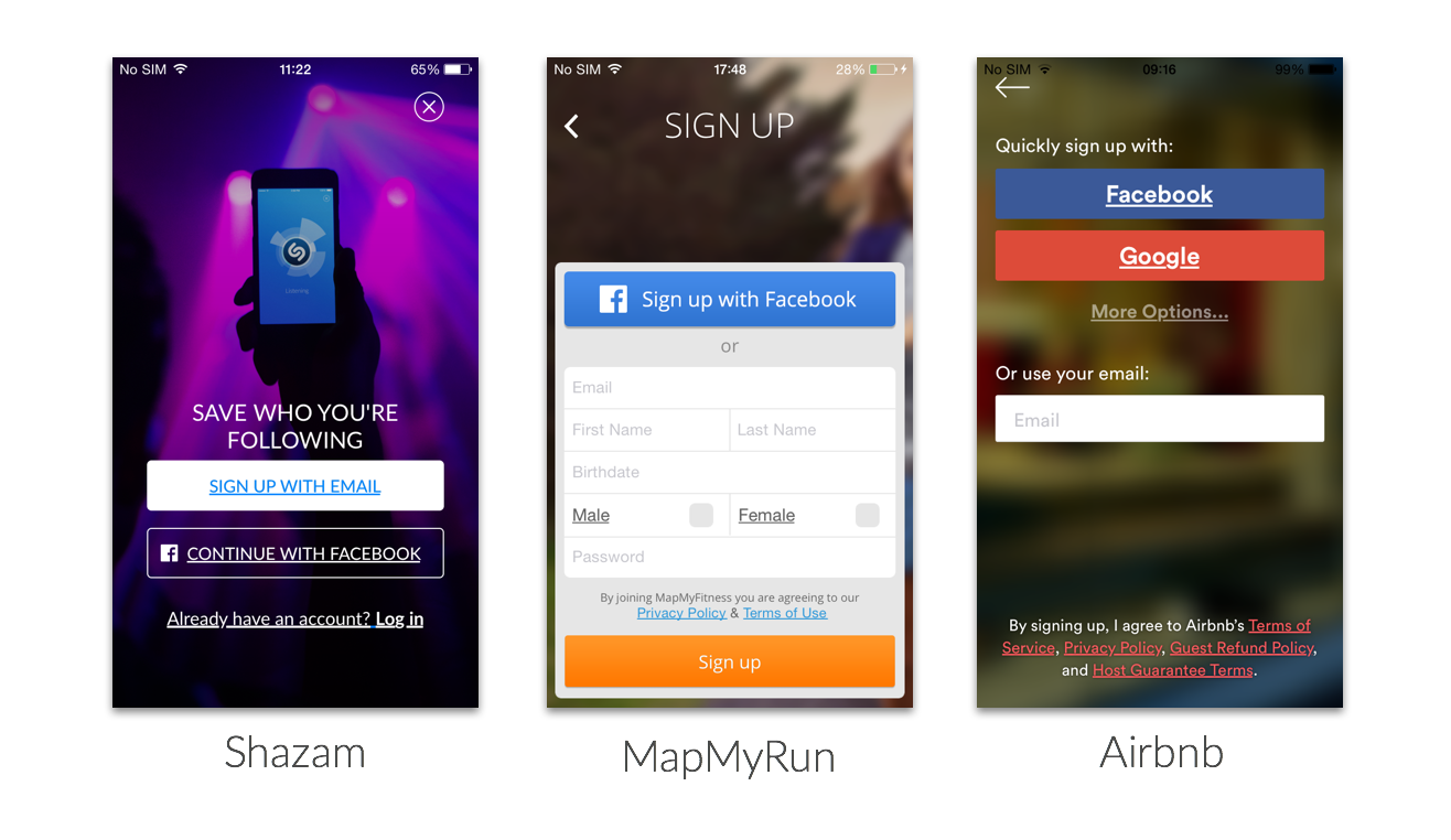
2. User Profiles
- Improves individual identity and credibility with other users
- Stores interests, preferences, personal data, etc.
- Common information: profile picture, username, real name, short bio, preferences, location, number of followers/follows/friends, recent activity
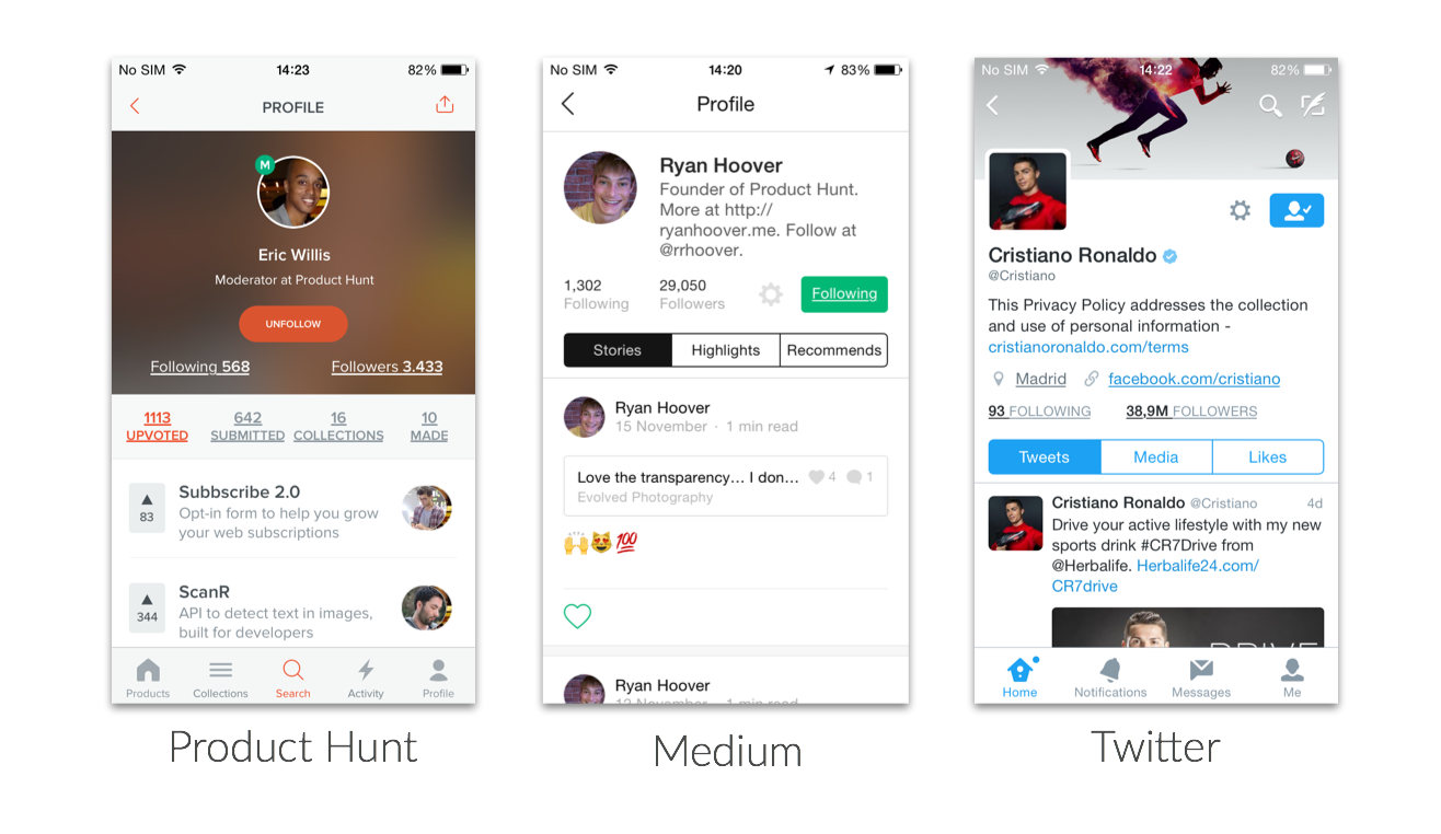
3. Friends/Followers
- Creates a user graph in your app
- Two major models to establish connections: friends (private network) and following (public network)
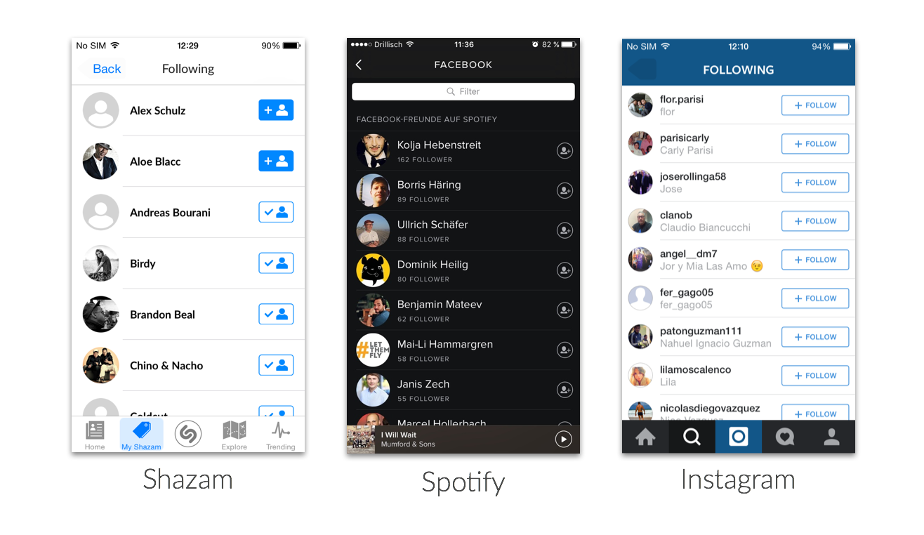
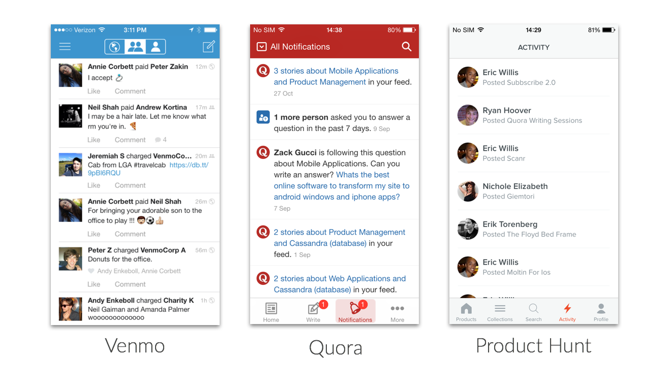
4. Notification Feed
- Makes activity of a user’s network visible in a single view
- Drives content discovery through other users
- Powerful for retention, especially when combined with push notifications, email and notification icons
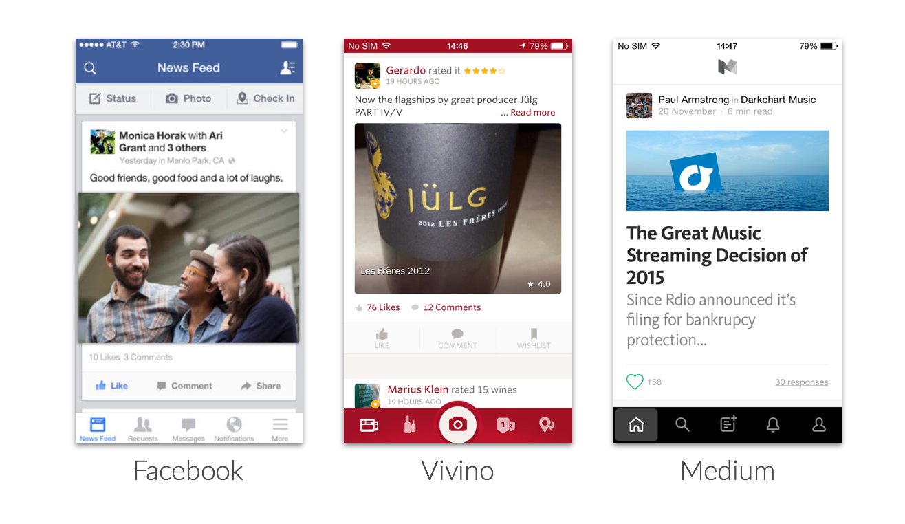
5. News Feed
- Constant stream of rich content from people or other sources a user is following
- Can include user generated content (posts, pictures, videos)
- Often includes like and comment functionality
- Algorithms can serve as filters to achieve higher relevance
- Content recommendations can harvest the data that is collected from the user network
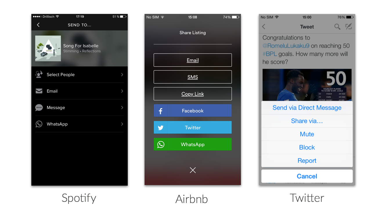
6. Outbound Sharing
- Sharing content to other, established social networks (one to many)
- Potential to grow the user base organically
- Prominent share buttons are important to drive adoption
- Mostly used with native elements of the respective mobile platform
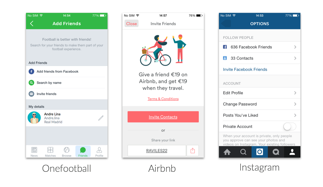
7. Invite Friends
- Inviting specific people to start using an app (one to one)
- Usually personal messaging (“Join me in this app�)
- Deferred deep-linking should be leveraged to create a personalized experience for the invitee
- Powerful tool for viral growth, when motivation/incentive to invite others is high enough
- Common channels for invites are E-Mail, SMS, Whatsapp and Facebook Messenger
A framework for creating social networks
When building a social experience into an app, it often might seem like a huge project with a lot of different paths one could take. However, if you analyze how successful companies have turned their product into a network you will notice a common feature set.
There are 7 core features that are the backbone of many social networks: social login, user profiles, friends/follower connections, notifications feed, news feed, outbound sharing and invite friends.
Plenty of successful products have proven how these features can be implemented successfully and at the same time how these features have had a massive impact on user retention, engagement and an app’s organic (or viral) growth. Therefore we consider this as the feature framework that everybody should look into when building a community into their products.
]]>
Not only Facebook, Twitter and other big players are examples of successful social networks. Many other apps have achieved an impressive growth and the loyalty of their users by creating social networks in other verticals. As people strive for individuality and want to connect with people with the same interests,
]]>
Not only Facebook, Twitter and other big players are examples of successful social networks. Many other apps have achieved an impressive growth and the loyalty of their users by creating social networks in other verticals. As people strive for individuality and want to connect with people with the same interests, generic social networks such as Facebook and Twitter do not suit their needs all the time.
A great example is MapMyRun, one of the most successful apps in the Health & Fitness category, where users can track their workouts and share them with the community. By making use of social features, MapMyRun has created a great community experience around workout exercises and has driven its platform to outperform the majority of fitness apps. This has made MapMyRun a huge success for app publisher MapMyFitness, who in 2014 reported to have more than 30 million members in total.
To understand how its social features have allowed MapMyRun to become one of the most successful apps in the Health & Fitness category, we took a deep look into the user experience of its social features.
Here is a slideshare presentation with our learnings:
We see 3 main areas where MapMyRun does a great job in leveraging social features to grow, engage and retain its users:
Onboarding the user
- Community features are very prominent during onboarding. Right after the first swipe the benefits of joining the community are clearly stated.
- The users know from the beginning that MapMyRun is a place where they will connect with friends.
- Facebook as the social login: This allows MapMyRun to take advantage of the existing social graph in Facebook, which enables them to grow their own network quickly.
Driving adoption of social features
- Notification bubble on the navigation menu creates awareness for social features.
- 3 prominent entry points to the social features (profile, activity feed, friends) instead of isolating the community into one single area of the app.
- User generated content is a key element to fuel the social community.
Growing the social graph
- Recommendation of Facebook friends, who are already members of the community.
- Adding new friends is possible in all 3 sections (profile, activity feed, friends).
- Users can post to Twitter and Facebook to share the app. One-to-One invitation via SMS and Email is not personalized and could be improved.
- Global user search for adding other users is available, too. User generated content can simultaneously be shared to Facebook or Twitter, which can drive organic growth.
MapMyRun is a great example of how social features can make apps extremely successful. MapMyRun has achieved an enormous growth and has become one of the most successful apps in the App Store and Google Play Store. The deep integration of social features has enabled MapMyRun to build a viral and defensible product.
Creating awareness of the social features in the onboarding, a good implementation in the navigation and finally, a well-thought and broad invitation flow, are the three core aspects that are probably very important for MapMyRun’s success. MapMyRun should serve as an example not only for fitness apps, but also for apps from any other categories that want to create a relevant, personal and social experience around their product.
]]>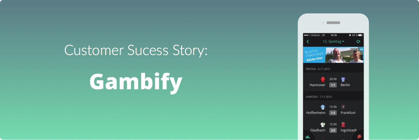
lets users compete for the football (a.k.a. "soccer") prediction crown: in private and public groups users can place their virtual bets on football matches of the Champions League, Euro League, German Bundesliga and next year on the Euro 2023. The better your bets, the more points you
]]>
lets users compete for the football (a.k.a. "soccer") prediction crown: in private and public groups users can place their virtual bets on football matches of the Champions League, Euro League, German Bundesliga and next year on the Euro 2023. The better your bets, the more points you earn. These points can be redeemed for rewards and used for participating in competitions for the chance to win match tickets and other special prices.
Through its streamlined user experience and the smart mechanics around leaderboards and groups, Gambify already had above-average retention and engagement metrics. An average 30 day retention rate of 75% is a number that very few apps in the sports category are able to achieve. The simple yet addictive model even attracted some international football stars such as Toni Kroos of Real Madrid, who is an active Gambify user. Nevertheless the makers of Gambify felt that there are a few missing pieces in the community experience of their product, says Gambify CEO Tobias Degele:
"Our user base already was pretty engaged, but we thought that we had to go further. We wanted to go beyond leaderboards and groups. Since we wanted to strengthen the user-to-user connection, we knew we had to enable users to follow each other."
After looking into what that would exactly mean for their product, Gambify decided to introduce three major additions to their social features:
- Following Users
- Public User Profiles
- Activity Feed
By making the activity of other users more visible, Gambify wanted to drive users back to their app beyond existing usage patterns that were mostly based on placing bets and comparing results after a match day. The hypothesis was, that with these new features users would have a less anonymous experience and that the interaction with others would make users come back more frequently.
The Integration
After it was clear what Gambify wanted to build, research began. How are other successful apps solving these features and what could the tech stack look like? Gambify CTO Marc Höffl explains the research process:
"When researching for best practices and tools for building this, we came across Tapglue. After looking deeply into their platform, we decided against building these features on our own - the hassle-free scalability and much faster time to market convinced us."
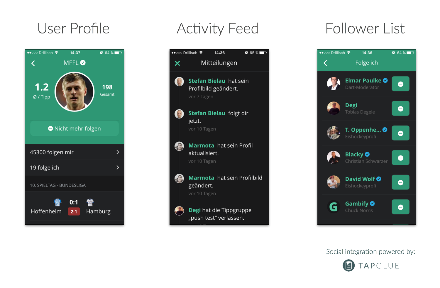
Including concept and design phase, Gambify integrated the Tapglue Platform within less than a week into their and app. Gambify is now able to provide their users with a whole new experience. By letting users visit others people's profiles and adding the functionality to follow others, the experience feels much less loose. You can now stay up to date with what others are doing. Amongst other things, users now get notified if somebody joins or leaves a betting group, changes their profile picture or if they gain a new follower.
Tobias explains what has changed for their user base:
"Every time users open the app, they now actually experience the immense activity of others. They have a much higher motivation to be more active, come back more frequently, place their bets and explore the community."
The Results
Having already outstanding retention rates, Gambify's focus was to increase the user engagement in each session. Before integrating, they determined average number of sessions per user and impressions per session as the metrics they wanted to monitor closely.
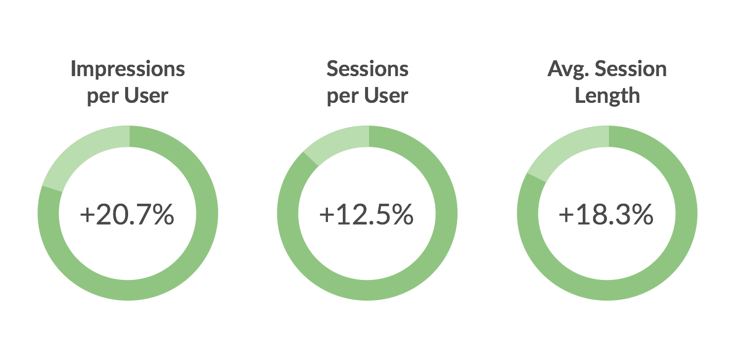
The results look more than promising: Just two match days after the integration, Gambify already saw an impressive jump in their core metrics. Comparing match days before and after the integration, the number of sessions per active user increased by +12,5%. Looking at the number of impressions each user does, with +20,7% the uplift is even more impressive. Not only do active users come back more frequently and visit more screens, they also stay longer: the session length per user increased by +18,3%.
Tobias is more than happy with those results:
]]>"Those results are much better than what we expected. We're excited to monitor the numbers closely over the next weeks to see what the impact on the overall retention will be. With these promising numbers, we will definitely enhance the new social features even more and introduce new features to our activity feed."

Every new product or feature that is launched based on a community of users has the same chicken or egg problem. As long as there are not enough people to fuel the community, it will be difficult to attract and retain new users for this product or feature as the benefit of the community is small. We call this the Empty Room Problem.
Once the community gets bigger and engagement increases, it will become much easier to grow - the bigger the community, the bigger the value for each individual. This momentum is not easy to gain, but, once achieved, it can lead to exponential growth.
It's likely you will face this challenge when launching a social activity feed. It is one of the biggest concerns of our customers when we talk about adding a social layer to their app. There are several things you can do in order to foster adoption once a new user signs up for your app and starts looking into the activity feed. In this post, I’ll outline some of them and explain why a dedicated plan to gain initial traction for your activity feed is so important.
Why is it important to think about the Empty Room Problem?
So, you’re actively looking into launching a social activity feed or another social feature. If you think through the whole user flow, you might start having concerns that each user's number of connections will be too low to bring life into the feed. Great thought! It is extremely important to think about this early on, and - since you’ll be launching this from scratch - chances are indeed high that the social graph in your product is rather small for each user.
This doesn’t mean you shouldn’t implement the feature. Neither does it mean you should just build and „hope they will come“. It means you should work out a plan of at least 3 or 4 actions that can help to overcome the initial lack of traction and engagement. Otherwise, there is a high risk that users will bounce right off again and will not see the activity feed as valuable as it can be.
Ultimately, this would lead to the evaluation that a social activity was not the right choice for your product. Most of the time, it is about a poor execution and just not having a plan to overcome the Empty Room Problem, though. So, I recommend not to just cross fingers that users will come once you launch it. Work out a detailed plan, with activities that will drive adoption.
The following list of actions shall help you to figure out how to best launch your activity feed.
What can you do about the Empty Room Problem?
Measure adoption and constantly optimize after launch
In order to be able to evaluate the performance of your activity feed and your activities promoting it, you need to have a way to measure user adoption. If you don’t have an exact idea on the share of users visiting the activity feed, how often they visit it, how much time they spend, which type of feed entry they click on, etc., you cannot evaluate the success of the feature properly. That’s why it’s important to have a mobile analytics solution in place, and track the in-app events that are relevant to the performance of your activity feed.
Having proper analytics implemented puts you in the position to constantly measure the most important metrics around your activity feed. From here you can start tweaking your product and marketing to improve the adoption of your activity feed. I recommend setting up a simple one-page report for this, which you look at on a weekly or bi-weekly basis.
Integrate onboarding feed entries
Trying out a new feature only to find out you cannot use it is frustrating. If a user opens your new activity feed but does not have any friends in your app yet, you should avoid displaying an empty feed.
Make use of the user’s interest and show him the great benefits of your new feature. Implement some pre-defined feed entries that show what the feed can look like once filled with the user’s friends. Communicate how awesome this feed is for content discovery and to experience your product together with others.
Encourage users to invite friends
Potentially, for the first time ever, users finally have a proper reason to invite others to your product. Adding friends in your app now provides the user with an immediate benefit - an experience that cannot be achieved without such social features. It’s the basis for a viral user growth machine.
If you communicate the value of your new social activity feed well and the user gets it, it’s the perfect moment to say "Hey, this is much more fun with your friends. Invite some of them!“. So, designing a great "invite friends“ flow, instead of showing an empty feed, will not only bring you more users but also improve the adoption of your new social feature.
Notify users when their friends join
Once certain users had the experience that your activity feed was rather empty, clearly, they will not have experienced the real value behind it. It should be of high priority for you to achieve this „experienced value“ for as many users as possible.
Naturally your most curious users will experience the Empty Room Problem the most. That’s the hard life of being an early adopter. This does not mean that their social graph in your app won’t grow over time, though. Even if the first experience wasn’t the best one, you should remind those users about your activity feed from time to time. The perfect reason to do this is if someone in the user’s network has started using your app. Set up some sort of notification for that (e. g., an entry in the news feed, a push notification, or an email).
Suggest or auto-follow featured users
If your community / network will be based on the follower model, which means users can discover other users’ profile publicly and start following them, you should definitely consider working with featured users. These users would be displayed to every new user starting to use your activity feed. You can either just suggest them or create a follower connection for them by default (with the ability to unfollow seamlessly).
There are various ways to gather a group of featured users to display to new members in your community. You could use members of your team, identify heavy users through engagement data, or manually pick community ambassadors for your product. The goal is to provide new users with interesting people they can follow to benefit from your social news or activity feed from the first session.
Create smart entry points into the feed
How should users experience your awesome new feature if they don’t know about it? So, tell them about it at the right places. Think about „secondary entry points“ besides the main one which might be in your tab bar or side drawer navigation. Here are some ideas for those secondary entry points:
- dialog when a feed entry is triggered (like, recommend, check-in, etc.)
- pop-up message that appears occasionally
- in-app banner advertising your new feature
Broadcast product notifications in the feed
Integrating a social activity feed does not only create a community in your product, it also gives you a new real-time communication channel to your users. Besides letting your user network fill this feed, you should also consider to do this on your own. Thinking about the social activity feed also as a place for notifications, you could broadcast messages about new app versions and features, feature certain pieces of content, etc. Those notifications can be triggered manually or automatically from your system. In both cases, they will bring life to your activity feed, which means users will perceive it more valuable.
Create and execute a marketing plan for the launch
Adding a social layer to your app is just great news. You should not forget to have proper plan for external communication in place. This should involve your own channels such as your blog, twitter, or the app store update messages, as well as external channels such as PR and advertising. Making a social transition in your product experience should be considered a major iteration of your product, and you should plan your communication accordingly.
Conclusions
Not having a solid plan to overcome the Empty Room Problem when launching a social product from scratch, or when implementing a social activity feed, can be a high risk for its success. No matter how well you design and implement it, if it does not see relevant user traction, chances are high that it won’t be successful. That’s why thinking about this challenge has to be an integral part of your launch strategy. However, there are good practices that you can take up to minimize the risk that your activity feed will lack adoption.
Thinking carefully about the new user experience is crucial. What will people see in the activity feed if they don’t have any connections in your app yet? Will you show a frustratingly empty state, or a compelling onboarding flow with built-in feed entries? Will you leave it up to a user's imagination what a lively feed will look like or will you fill it through recommended users to follow? Will you have her leave frustrated or encourage her to invite some friends?
There are plenty of things you can do to overcome the Empty Room Problem. And this is what the most successful social products out there have done, or still do. Success with communities does not happen randomly. It is always the result of a well-executed product strategy. Therefore, I highly recommend thinking about the launch strategy of your social activity feed (or other community features) from the moment you plan to implement it.
You liked this article? Follow us on and don't miss out on new stuff!
by drocpsu ()
]]>
We have exciting news to share: The release of the . Our brand new SDK makes it even easier to add a social activity feed and other powerful social features to your mobile app. By using our SDK you have the whole Tapglue platform at your fingertips. It takes away the majority of implementation work, so you can concentrate on an outstanding user experience and on growing your community.
Our mission is to make the power of social networks accessible to a wider range of mobile developers. A big part of this is developing a powerful, flexible and scalable API that offers all necessary backend functionality you need to build a social experience around your product. We think a state-of-the-art developer tool should not stop at the backend though. Having worked in mobile for years, we know that a simple and fast integration is key when using 3rd party tools. That's why a modern, lightweight and powerful SDK is core Tapglue's in product strategy - with many awesome things to come in the future.
By creating the Tapglue SDK we enter the client side which we think is necessary to provide a comprehensive tool for mobile developers. We're solving challenges like API communication, offline behavior and parsing in the most efficient way - so you can focus on implementing smooth user flows, lovely UIs and stunning animations.
There are certain things that were important to us when developing our SDK, so here are some highlights:
Super fast integration: You can add Tapglue to your app with just a few lines of code. We've internally implemented our API in test apps in less than one hours.
Open Source: We are big believers in transparency, openness and in participating in the open source developer community. That's why our SDK is 100% open source and available on Github.
Performance: The same love for state-of-the-art technology we put into our API, we also put into our SDKs. That's why we use the latest patterns and practices to deliver an outstanding performance.
Offline Behavior: We know the kinks that developing in the mobile environment can have. That's why we put emphasis on the details. Tapglue will work seamlessly even if your user is on a bad or no connection.
Lightweight: Our SDK doesn't make your project any heavier. It's less than 200KB in size. It won't stress your users' bandwidth when downloading your app.
Flexible: We're not forcing you to use our SDK. You can still hook up with our directly if you wish.
Get started with the Tapglue iOS SDK
We can't wait for you to try out what we've built and see all your awesome use cases. We also appreciate any kind of feedback! To get you started we've put together an that includes all the information you need to get started.
Remember that you will need in order to start using the SDK. If you don't have access yet, just and we'll handle it!
]]>
Staying on top of the latest developments in the mobile market is core to be successful. Learning about the latest trends, participating in discussions about the future and knowing the hottest new technologies is necessary to be a relevant player in this ever-changing environment.
We have collected 10 mobile influencers that inspire us and shape the discussions in the mobile industry. Follow them to always be on top of the ecosystem.
1. Benedict Evans, @
It seems Benedict Evans is one of the smartest guys on earth, having an incredible overview on the whole mobile ecosystem and where it's going. He is and publishes a which we highly recommend.
2. Luke Wroblewski, @
Luke Wroblewski is Product Director at Google and one of the leading product minds on the internet. Being author of his thoughts were and are influencing what mobile products look like today.
3. Dan Kaplan, @
Dan Kaplan is all about growth. He helped amazing companies like Twilio, Asana and Salesforce to get their marketing right. He is also columnist at TechCrunch and writes a .
4. Maribel Lopez, @
Maribel Lopez founded , a leading mobile market research firm. She writes about how mobile changes the world on the and is author at .
5. Ina Fried, @
Journalist Ina Friend writes excellent pieces on everything mobile at . Make sure to follow her and you won't miss out on the latest trends of the industry.
6. Andrew Chen, @
Andrew Chen has written more than on mobile, user growth and fundraising. We recommend to subscribe to his to receive his latest pieces straight to your inbox.
7. Peggy Anne Salz, @
Peggy Anne Salz is analyst and author, leading the technology site . She is also author at and writes about mobile marketing, engagement and apps.
8. Peter Kafka, @
Peter Kafka is a widely regarded tech journalist who is writing for . Having worked for several tech media houses his articles are always thoughtful reads that we recommend.
9. Kevin C. Tofel, @
Kevin C. Tofel writes about the mobile industry since 2003. He covers mobile platforms, apps and services on and we highly recommend his articles, analyzes and podcasts.
10. Benjamin Robbins, @
Last but not least, we recommend to follow Benjamin Robbins. He spent an entire year solely and regularly writes on everything mobile for .
Do you have other awesome influencers we should not miss? Head over to and let us know!
]]>